li The art and development of Thin Glynn. All images and design rights property of Luke Davis. All characters property of Luke Davis

Wednesday, November 30, 2005

Opening scene background

I have issues with the colour and digital flatness of this background, I want to rough it up a bit with some brush strokes and involve more variation in colour. Also some texture. I was thinking about involving some wallpaper pattern which would be subtley integrated into the existing colour scheme. Hate the colour of the computer and fax machine they seem dead and dull, where I feel that the fax machine needs to be interesting and strong because it is important in the plot. I think I need to flat out decide whether I will go for rich varied colour scheme or stick to a certain colour with which I will play with light and dark areas of objects in order to suggest their involvement in the scene.

Tuesday, November 29, 2005

Glynn


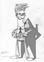
Hopefully the final model design of (human) Glynn. Had some issues with the hair colour, basically due to the gaming settings I had adjusted my pc monitor for ... oops. This is my postcard design ~ I wanted to involve all the aspects of the film into one image. Apart from the paper airplane and the throwing star, I have managed to do this. I will include the throwing star into the title design like the header on my blog.
Pleased with the shoes, and the white socks (as requested by all). Unfortunatly the pen and shirt pocket has been lost just because of the lack of space on the upper torso.
I will eventually painter or pshop this image so it follows the shading that the pencil sketch displays. I wanted to achieve the Superman 'bulge' in the trousers, as that is what the stance is based upon.

Tuesday, November 22, 2005

Wmv animatic


Animatic - WMV
Finally managed to reduce the file size of this animatic. Still attempting to get the .mov below 10mb.
Hope that there isnt too many artifacts etc in this low res vid.
If you have any tips on reducing the file size of movs. Please let me know.

Update - minor changes to story


Friday, November 18, 2005

3d fimo model

Fancied taking a creative diversion away from 2d today. Took a while to get back into the modelling mode. This is what I ended up with. Painted with acrylic. Suppose it could be used for awkward angles, in order to see the shape of his hair and position of nose against the face. Would be nice to finish it off sometime, just as a souvenir of this project.

Thursday, November 17, 2005

New narrative - storyboard


Steamy pie in window

Glynn is making an origami cup, in which we see him pour a beverage. He has laid out a table mat and knife n fork on his desk ready to eat his lunch … a steamy hot pie, which is cooling in his window. As Glynn finishes preparing his desk for his much anticipated meal, he turns around to find that the pigeon is stood in the pie eating from the centre. The pigeon can’t see Glynn as it is frantically gobbling the centre of the pie away, so Glynn sneaks (tiptoes) over to grab the pigeon. Just as he is about to reach for the pigeon he steps on a creaky floorboard which startles the pigeon causing it to raise its head and become aware of the impending danger. Glynn lunges to close the window but the pigeon whips out through the rapidly closing gap.

Motive of pigeon- Scavenging for food

Motive of Glynn- Make origami, eat lunch + get rid of pigeon by closing window.

Other changes include : Thin Glynn jumping directly into a pigeons nest after escaping the shredder building.
Thin Glynn escapes scene after cutting down the piano, he leans against the wall and wipes the sweat off his brow - and is immediatly plucked from the pavement by a street cleaner's rubbish grabber.

Wednesday, November 16, 2005

Development of Thin Glynn model


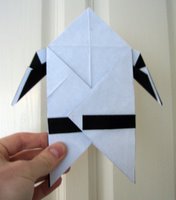
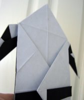
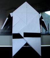
The black part of the model is the cinefoil, which gives the model strength. The final model will be entirely covered in white paper.

Today I made progress with the development of the Thin Glynn model, by successfully backing an a4 sheet of paper with cinefoil. The cinefoil will strengthen the paper so that the paper stays bent when animating. This is my first encounter with the material, and it is a strange experience. The cinefoil will bend like paper, but once it is bent you cannot remove the crease! So much precaution will have to be taken (and was taken, after Tim Allen warned me about this problem) when making the models. The biggest problem I had today was finding a suitable adhesive, which did not set rock solid - which would make the model unbendable. The adhesive also had to be thick wnough to not soak in to the plain paper - causing it to appear see through. PVA, copydex, spray mount and Uhu were tried, but all failed. My eventual choice of adhesive is Araldite, very strong.. bendable if applied thinly and does not soak into the paper! Attached are photos of this new model which I have folded in the thin Glynn origami form. I will post photos of the creation process soon.

Monday, November 14, 2005

Finished board

Start


When I came to draw the rest of the storyboard I found that the story had changed so little since the last storyboard. Therefore I have decided to save myself about 3 days of (basically tracing) drawing, by using these existing frames. I have inserted some new frames, those who can remember the first storyboard I presented might just about see the differences. Each of these .jpegs are between 1mb- 1.5mb and contain many more frames, so if its difficult to see the detail you should be able to zoom in on the picture (you can if you are using firefox). I have stuck with the original ending until I have conversed with James about Tim's feedback. If I do change the ending I will post the new frames which change.

Sunday, November 13, 2005

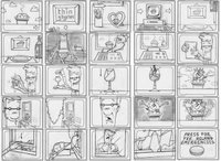
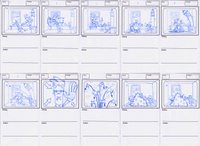
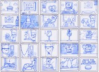
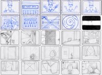
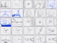
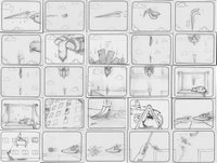
39 frames of Thin Glynn

Frames 1 - 10 (above)

Frames 11-20 (above)

Frames 21-30 (above)

Frames 31-39 (above)

Hey'all, heres the latest progress with my film production for Thin Glynn. Attached to this post are the first 39 frames.. (need some close-up shots ere 'n' there). If you see any deadly errors with the camera direction please put your hand up and let me know about it. Storyboard production is still on-going, I hope to finish with about 100 frames. The rest of the storyboard will come together pretty fast because I have already drawn them a little while ago. The pigeon/raven debate is still on-going with a 50:50 feedback ratio from people. I do like the pigeon and they have nice distinctive colour and form. Once the second half of the film is storyboarded we should be able to get a better feel for which character we naturally side with. By the way... the Big Ben model is made from origami (will be more obvious in finished film) and Glynn is putting the last piece on to complete his sculpture! I can't stress enough how welcome comments are on this blog (at this stage especially) so fire away if you get the urge!

Thanks

Thursday, November 10, 2005

Todays stat. update

Been grinding through the new storyboard today which will be used for the animatic too. Sorted out some niggling problems with the start of the story, to do with the affect of the pigeon's startling squawk. Ill post some frames tommorow. Human Glynn will now have about 10-15 secs more screen-time .. woo! My brother 'Guy' has also brought up the possibility of the bird character being switched from 'pigeon' to 'raven/crow' to better emphasise the good vs. bad relationship. The black of the raven/crow, better contrasting the white of Thin Glynn's paper torso. Think Luke Skywalker (white) and Darth Vader (black). Although the pigeon fits in with the Uk urban setting, the black of the raven/crow (e.g against the light blue sky when we first see him) is such a strong idea which will imprint character on Glynn's nemesis. Guy's idea has caused a difficult decision in my mind. If you dont mind (and if its possible for you) please vote on which path you prefer!?!

Tuesday, November 08, 2005

Thin Glynn UNFOLDED!

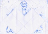
Opened origami form of Thin Glynn - Flat paper

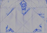
Darkened version of above image to show folds of paper clearly.

I couldnt wait to open up Thin Glynn this time (unlike before) ! This accidental composition of his form scattered across the flat paper was really exciting to discover, I just hoped that the sketched design wouldnt end up on the back of the sheet! Fortunatly, every section of his torso apart from his finger tips stayed on the front of the paper. The composition was so much better than I had expected, it isnt broken so much that it loses all reference to the original design; but instead achieves an aesthetic level of symmetry due to the way that it was folded. The coloured or faxed damaged version of the image once p'shopped will be much clearer, and will present an intresting visual link to his preceeding 2d form.

Transformation onto paper


When Glynn is faxed, he is transformed into a piece of paper. 90% of feedback from people side with the idea that some part of Glynn's original image (2d form) should be printed onto this paper. Emma Baker started the ball rolling at the start of the summer with her comment on the 1st script "like the idea here but how does the audience know the paper is Glynn? Is he going to display a typical characteristic or are you just going to tell us it is him? Maybe give him an orange corner, or something to represent his hair? Just so there is something recognisable." When I presented my film, the animation group again liked the idea of his 2d image being printed onto the sheet of paper. Due to the head shape of 'Thin Glynn' it was going to be difficult to incorporate his hair; especially as at this time he had a large afro. 7th November lunchtime chat with Johnny again surfaced this recurring idea. I had been worried about the in-world physics which crippled this idea because if he was printed as full design of Glynn onto the flat sheet of paper... the following folds would jumble the print all over the place once he was in the man / crane / airplane / throwing-star shape. Johnny proposed the idea of designing the print so that it works as the man shape, and then unfold - therefore allowing the sections of his body to self-jumble themselves over the initial flat paper. This idea fixed the forementioned physical problem, and opened up the oppourtunity to enhance the facial character animation once in origiami form (something that was going to let down the strong character that had been built up by 2d Glynn). So... onto the fresh clone of Thin Glynn I sketched Glynn's human form so that it fit into the constraints of the origami form. The result is a very awkward looking stance, but I think that this fits in with the awkward process that Glynn was squeezed through in order to reach this stage! The main torso of Glynn's body is stretched slightly so that his belt fits in with the belt on the origami form. Overall I like the stance and composition of Glynn on this paper, and the transformation alongside the print of his existing 2d form works on so many levels. In the next post I will explore the uncomposed affect this sketch has on the (unfolded) flat sheet of paper. (CHANGES)- I may depending on feedback, move his feet/shoes to the corner of the origami form.

3 of the most scary hours!

I have spent this morning attempting to recreate 'Thin Glynn' (the origami version!). After a frustrating 30 minutes, 1 on1 with the sheet of blank paper I was no further than I'd began - just with a heavily creased web of folds. Coffee turned ice cold as I pondered the neccesity of a surgical dissection of the original 'Thin Glynn'... Will I be able to read anything from his exposed carcass of folds?... Can I put it back together again!? So, so, so much regret for not documenting its creation at the time! I eventually took the plunge and tentatively opened up the frightening array of interlocking folds. An hour later and I had successfully cloned the original with less folds and a thicker belt; to better coincide with the design of (2d) Glynn.

Friday, November 04, 2005

Stopmotion composite tester

This clip is the first of several animation tests to experiment with the composition of 3d stopmotion composited onto a 2d background. This render is purely lasso'd photos with no colour or effect correction. The 2d background has a pan blur operator. Im very pleased with the result of the test, but am skeptical about whether the similar colours of the sky and origami crane are the reason that the composition works. I will be continuing these tests over the next week with 'thin glynn' (the man shaped origami).

Thursday, November 03, 2005

Pigeon head bobbing test

A quick animation test of the pigeon bobbing its head left to right. I aim for a simple animation style but with extra animated details such as the nice flopping feathers in this test.

Storyboard pigeon


Storyboard sketch of the pigeon, and Thin Glynn in the foreground peering around the corner. I'm liking the design of the pigeon better in this frame rather than my initial sketches (in previous post).

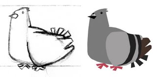
Pigeon designs


Initial pencil sketch and photoshopped colour version. Neck will be longer and eyes slightly smaller. I may also extend the legs to showmore than just the feet.

Scratch head

Check out my Glynn animation test, simple scratch of the head to test movement of arm and rendering techniques. Please let me know your opinions. p.s The hair looks awful when it moves, too much movement.


Tuesday, November 01, 2005

First coloured frame of animation test


Flat colour Glynn - first frame of current animation test. Should the pocket pen make a comeback? Vote now!

Scratch line-test

Quick line test for the physical movement of Glynns arm, and some expression. Working on the coloured version now. Couldnt get the gif to work, so this is a frame from the test.