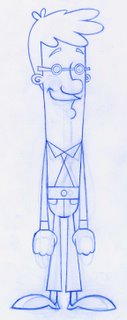
New and final Glynn design

Changed the face and the hair and the body and the clothes and the legs and the hands and the shoes.. because I was bored with the last design and it felt so forced. I wanted the lines to flow and I wanted his body to compliment the shape of his head, which really wasnt happening before because of his tubby shape. Im feeling better about this design.. the weight still feels a bit floaty but he wont be on screen for more than 30 secs so its really not an issue for myself at this stage of production.
Im glad that I have addressed my dislikes at this stage before beginning the animation process, otherwise I'm sure I would have fallen out with this idea and it would never have had reached its potential. Hopefully now .. these small changes have encouraged my patience and enthusiasm for this project as recently I have been feeling detached and sick of the impending mountain of work ahead of me.
*Smiles*

1 Comments:
Excellent work!!!
Post a Comment
<< Home