Saturday, October 29, 2005
Thursday, October 27, 2005
Wednesday, October 26, 2005
Tuesday, October 25, 2005
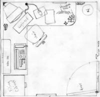
Office room design


The office room is the beginning scene in this film.
It now features a large Big Ben origami statue which
Glynn will be meticulously constructing when we first see him.
Only for a pigeon for make him jump and self-destruct
the giant origami tower. The office will also feature a desk chair
on which Glynn is balancing in order to gain enough height to
complete his tower of origami.
Monday, October 24, 2005
Colour design of Glynn

Featured to the right, is the colour design of Glynn worked from the original scanned sketch. His main features thanks to the colour, are : His glasses, hair, tie, belt and pocket pen! Thanks to the comments from the group - some or all of these features will be carried through the fax line to the piece of paper. Comments please on the character design and colour.
Wednesday, October 12, 2005
Character problems and development

This is the result of a design change in the character (AGAIN!) I achieved this by sketching a few new head shapes and eventually ran into the same shape as I had very first began with but with a change in the facial details. I shrunk the glasses lens size and removed the pupils as I felt that they devoured the characters focal point, and I instead want to focus on expressive human movement.
The character is still in pencil sketch form, but tomorrow will be devoted to testing colour design.
Tuesday, October 04, 2005

After struggling through my Glynn character spin around this morning, due to his oddly positioned eyes (basically on his nose) I began keyframing a short animation test starring this awkward character and a paper aeroplane. By now I had fixed the characters face, by positioning his eye behind his large nose, therefore allowing the spin around to work. Although I wasnt happy with making this change, it had to be done otherwise it would undoubtbly cause serious problems later on. Most people I showed the change to said that they in fact preferred the new one.
I started work on 10 keyframes which would form the basis for a short animation test starring Glynn throwing a paper aeroplane. After just a couple of keyframes, I decided to pause for lunch during which I decided that I could not work with the design I had simply because I despised the character.


